Where I came in
In my first week, I got to use both versions of Collaboratory: the original, where we filled every field by hand, and the AI version engineering had just launched.

The AI version was built one assumption: entry is slow because there are many fields to type. So it parsed the article and filled every field.
Problem at hand
Each entry took 15 to 30 minutes. The AI parser filled the form, but didn't show where its answers came from, so people still read the article and checked every answer. The AI saved typing, not time.
What testing showed
How I tested
I tested the current AI version with 12 participants, using the same 3 articles. Each was completed twice: once with AI, once by hand. I timed every entry and averaged across participants.
The bias I had to manage: doing the same article twice teaches you the answers. So I made two choices:
Separate sessions
I spread the rounds out so people wouldn't remember the answers.
What I found
People reacted in two opposite ways
Over-trust. When checking feels pointless, people stop, and a wrong answer reaches the dashboard looking like a right one.
The role flip. People went from doing the work to auditing a system they couldn't see into.
"Why am I doing double work? The AI already did it. I'll just send it."
Design principles


Design Process
Exploring the problem
Each exploration started from a problem I saw in testing. Some ideas worked, some I discarded.
Exploration 1: A browser extension

What I built
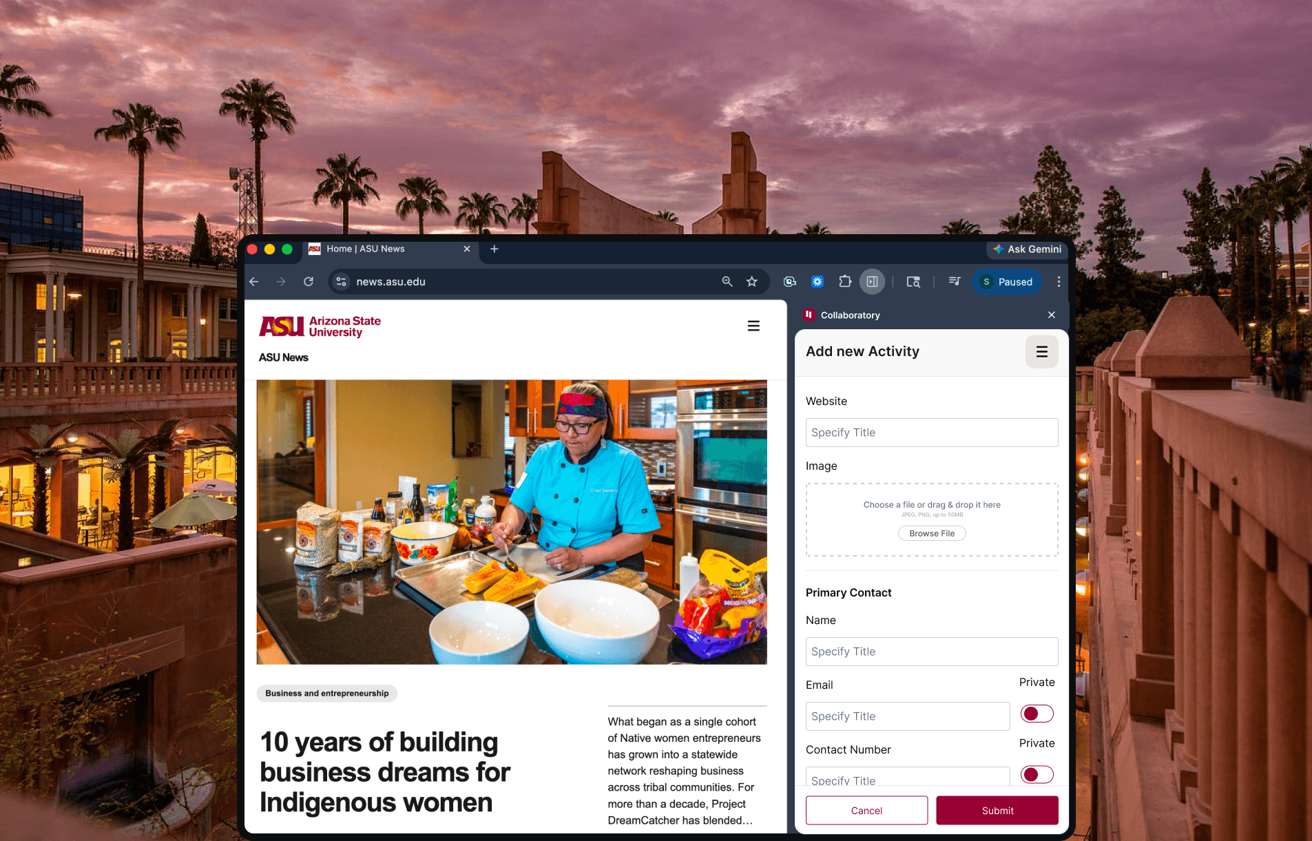
A side panel, like Jobright, that opens over any article you're reading. Add it in one click, without opening Collaboratory, and review it later.
Why it failed
Parsing an article takes time, so people sat waiting on the page they were reading. Running the AI outside Collaboratory also brought engineering constraints the team couldn't take on.
Insight
Fast capture doesn't help if the scan still makes people wait.
Exploration 2: One workspace. Findable answers. Form and AI in one window.

What I built
Everything inside Collaboratory. The AI fills the form, and the person reviews it on the same screen.
Why it worked
The scan runs once, in one place, and people check answers right where they work, with no switching between tools.
Insight
Fast capture doesn't help if the scan still makes people wait.
DESIGN DECISION 1
With the AI and the form on one screen, the next question was how to show where each answer came from. I tried three ways:
V1: The answer with a quick summary below
AI summarized where in the article it found the answer.
V2: The answer with a citation underneath.
People still had to find that sentence in the article.
V3: Highlight in the article beside the form.
Select a field, and the passage the AI used highlights.
Why Option V3 worked
The AI already finds the passage to get its answer, so showing it costs almost nothing. Checking goes from a search to a glance.
DESIGN DECISION 2
Once people could see where each answer came from, three gaps became obvious. Each one led to the next design change.
Gap 1: The article didn't have the answer, The AI still filled the fields
Fix: with no direct evidence, the field stays blank, with suggested answers below for the person to pick from the multiple options
Gap 2: Short articles left out key people, like a unit's VP or a college representative.
Fix: the AI searches the web for them and shows the link. Web answers are less reliable, so they had to look different from article answers.
Gap 3: People didn't know which fields to check first. Answers now came from the article, the web, or nowhere.
Option 1: Traffic light indicators
Why I dropped it: yellow read as "probably fine," so people skimmed, and red read as "error" instead of "your call."
Option 2: Source status tags
Neutral styling. No color implies "safe" or "broken." The words carry the meaning and also gave instruction to user what to do next.
DESIGN DECISION 3
Identifying the correct entries
The tension
Collaboratory is for community engagement, so filtering the right enteries was very crucial
The call
First screen asks for the article link, the activity owner and four qualifying questions together. Any "no" ends the flow with a clear message that this isn't community engagement.
Show the AI working
The tension
A blank wait while the AI scans gives people nothing to trust when the answers appear.
The call
A loader with a step list (scanning the document, checking the Collaboratory platform) and a scanner animation, so people see what the AI did before they're asked to check it.
Three review layouts, one decision
The tension
This is where people decide whether to trust each answer.
The call
A split view, with the five-step form on one side and the article on the other. Highlights follow the field in focus, and a drag handle lets people give more room to whichever side they're checking.
Reflection
What I'd do differently
I'd tie the confidence signal to the source from the start, instead of shipping colors and correcting later. I'd also measure accuracy alongside time in the first study, since accuracy is what the stakes demanded.

AI's job isn't to produce answers. It's to produce answers people can afford to trust.
If checking costs as much as doing, you've built a second job, not a shortcut.

Abstaining is a feature.
A system that knows when to say "I don't know" earns more trust than one that always has an answer.

Design can't start after AI ships.
V1 was a reasonable engineering solution to the wrong problem. The problem framing is design work.